Visit website
Industry
- Ecommerce
- Merch
About project
We partnered with DTLA Print, a Los Angeles–based print and apparel company, to redesign and rebuild their existing e-commerce website. The goal was to modernize the site’s visual identity and improve user experience. Website is being developed on WordPress with WooCommerce, keeping scalability, performance, and flexibility in mind. Our work includes UI/UX design, custom development and motion design, aiming to streamline the ordering process while keeping the site visually engaging and easy to use.
Challenges
One of the main challenges was balancing an eye-catching design with the technical structure of a WordPress/WooCommerce website that relies heavily on third-party plugins. This meant we had to design within certain limitations while still delivering a modern and professional look.
Approach
We began by mapping out the user journey and identifying opportunities to improve usability and product discovery. The design was built around a clean, bold visual style that matches the brand’s urban, creative identity while supporting a wide range of product categories and services.
On the technical side, we approached development with plugin compatibility and performance optimization in mind. Our team ensured that the site remains fast, secure, and flexible by choosing the right integrations and custom solutions where necessary.


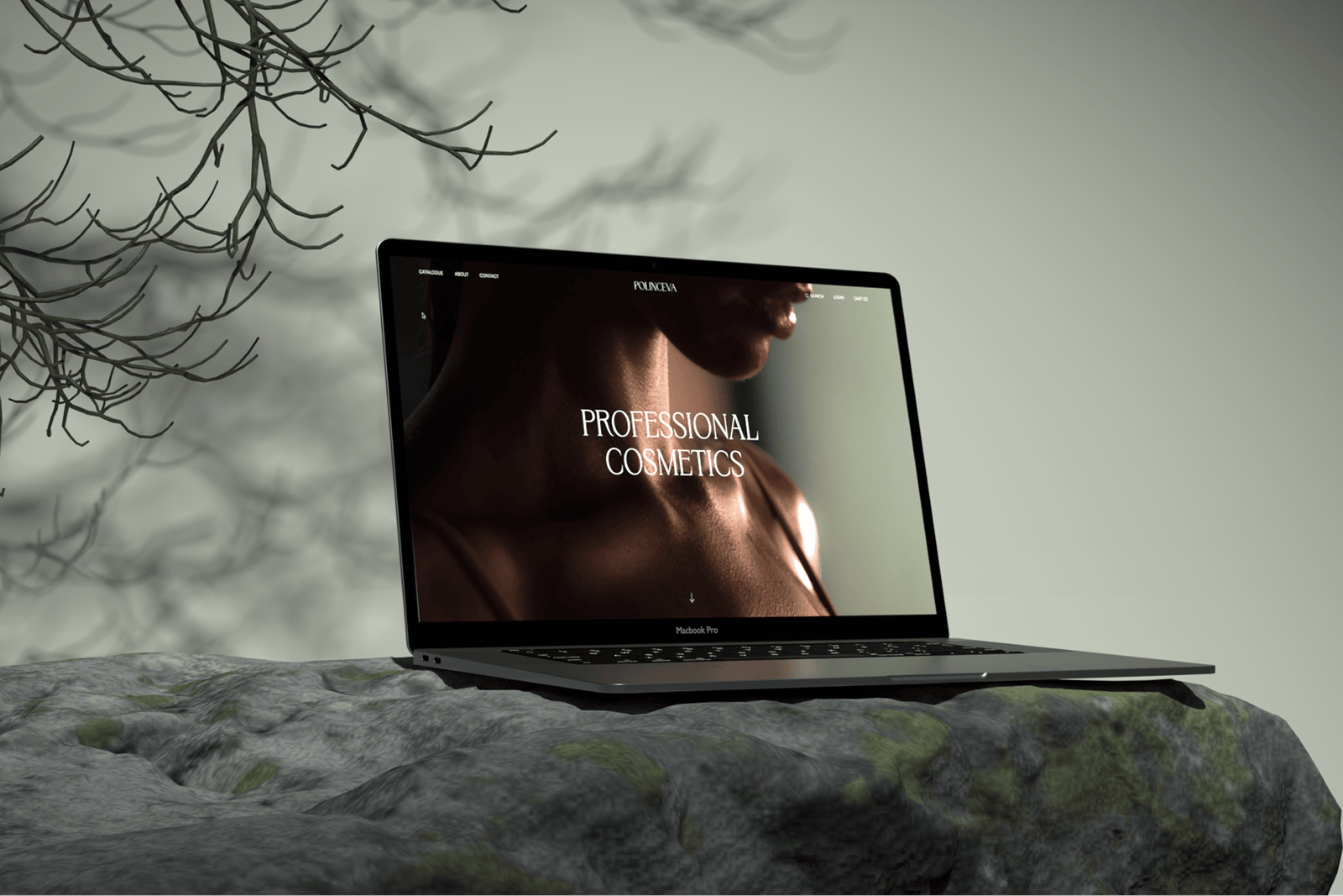
Homepage layout design
The first step of the project was establishing a strong visual foundation. We began by exploring the overall style of the website, focusing on how the brand should feel to users from the very first interaction. The homepage became the starting point for this exploration, as it sets expectations for the entire platform.
We designed the homepage to communicate clarity, professionalism and creative freedom. The layout emphasizes clean structure, strong typography and balanced spacing, allowing users to quickly understand what the platform offers. Visual elements were carefully placed to guide attention toward key actions, such as browsing categories, without overwhelming the user.
This stage was essential for aligning the visual language across all pages and ensuring that the website feels cohesive, modern and purpose-driven.


Mega menu
Challenges
One of the key usability challenges was navigation. The store offers a wide range of apparel products, including various types of T-shirts, long sleeves, hoodies, and accessories. Text-based navigation alone was not sufficient to clearly communicate these differences, especially for new users.
solution
To solve this, we designed a mega menu that incorporates visual previews of each product category. By showing images directly inside the navigation, users can instantly recognize product types without having to guess or open multiple pages. This significantly improves product discovery and reduces friction during browsing.
Mobile & Tablet Optimization
The mega menu was carefully structured to remain readable and visually balanced, even with a large number of categories. Special attention was paid to responsiveness, ensuring that the same clarity and usability are preserved on tablets and mobile devices. The navigation adapts fluidly across screen sizes, maintaining both functionality and aesthetics.
checkout
Challenges
DTLA Print’s previous checkout had usability issues and a weak visual hierarchy, which created significant friction for users. The layout was vertically stretched, forcing excessive scrolling, while information blocks were not clearly separated, making the page difficult to scan. Form fields and labels took up unnecessary space, and the overall flow felt confusing and unintuitive.
As a result, many users experienced difficulties completing the checkout and often abandoned their purchase, choosing competitors instead.
The redesign focused on improving visual hierarchy, simplifying the structure, and optimizing the checkout flow to reduce friction and guide users step by step.
The before and after comparison below highlights how the checkout evolved into a clearer, more structured experience.


Checkout Screens &
Responsive Design
Challenges
DTLA Print’s checkout uses WooCommerce plugins, which significantly limit layout flexibility, component behavior, and customization options. The main challenge was to improve usability and clarity while staying fully compatible with the existing plugin logic and delivering a modern, visually refined experience. All design decisions needed to carefully balance UX improvements with technical feasibility to ensure the solution could be realistically implemented and released.
solution
After restructuring the checkout, the focus shifted to addressing the key usability issues of the previous design. To reduce visual clutter and excessive scrolling, the input styles were redesigned with labels placed inside the fields, allowing the form to take up less vertical space. Content blocks were clearly separated, making it easier for users to scan the page, understand each step, and move through the checkout with confidence.
The checkout flow was further improved by refining the content structure. An Account section was added, allowing users to log in during checkout and receive loyalty points. The header was redesigned specifically for the Checkout and Cart pages to provide quick access to live chat and customer support. The Shipping Address was made the first required step instead of Billing Address, and an optional Tips section was introduced.
As a result, the redesigned checkout delivers a more compact, intuitive, and visually consistent experience across devices. By reducing friction and making the checkout easier to understand and use, the redesign contributed to an increase in conversion rate, while remaining fully compatible with the existing plugin-based system.


Other case studies
Want to see what else we've been working on? Take a look at more of our projects
We use cookies
This website uses cookies to ensure you get the best experience on our site. Read our Cookie Policy.